Which of the following would you use to edit the Shape, colour, and Text of your visualisations?
Correct Answer:
A
The Marks Card allows us not only to edit the Shape, Text and Colour, but also to modify the Tooltip and the level of detail of the visualisation!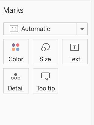
The Marks card is a key element for visual analysis in Tableau. As you drag fields to different properties in the Marks card, you add context and detail to the marks in the view.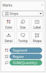
You use the Marks card to set the mark type (see Change the Type of Mark in the View), and to encode your data with color, size, shape, text, and detail. To change the mark settings, see Control the Appearance of Marks in the View.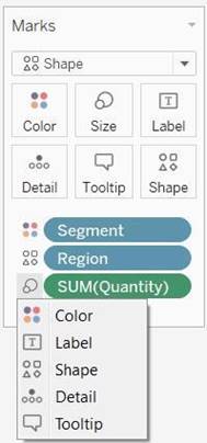
In this example, three different fields have been dragged to different properties in the Marks card. Segment is on Color, Region is on Shape, and Quantity is on Size.
After you add a field to the Marks card, you can click the icon next to the field to change the
property it is using. You can also click the property buttons in the Marks card to change those settings.
Many properties can have multiple fields. For example, you can add multiple fields to Label, Detail, Tooltip, and Color. Size and Shape can only have one field at a time. For more details, see Control the Appearance of Marks in the View.
Reference: https://help.tableau.com/current/pro/desktop/en-us/buildmanual_shelves.htm
Which two filter modes can you use with continuous filters? Choose two.
Correct Answer:
BC
According to the Tableau Help, there are two filter modes for continuous filters: Range of Values and Single Value. The help also states that “Range of Values lets you specify a minimum and maximum value for the filter using sliders or input fields” and “Single Value lets you select one value on a slider for the filter” (page 1).
You create the following visualization.
What is the first step to create the visual grouping of the 10 marks shown in blue?
Correct Answer:
A
To visually group marks in Tableau, you typically start by selecting the marks directly in the view. Once the desired marks are selected, you can then create a group from them. This will visually group the selected marks, as indicated by the blue color in the example provided.
Given a map, which of the following fields can be placed on Size,Shape,Detail,Color
Correct Answer:
B
Since Sales is a measure, it can easily be depicted via size.
To drill down and change the level of detail, Country is the correct choice since it
will contain STATE. We can then depict the various states by different shapes such as circle, square etc.
Finally, the Profit can be depicted via a color! Eg - Red for poor and green for excellent profits!
Reference: https://www.tableau.com/learn/tutorials/on-demand/aggregation-granularity-and-ratio-calculations
When is an axis created for the visualisation in Tableau?
Correct Answer:
D
An Individual Axis in Tableau is obtained by adding a continuous into Rows or Columns Shelf.
Example:
In order to show Individual Axis in Tableau First, we drag and drop the Color from Dimension shelf to Column Shelf. Next, we drag and drop the Sales Amount from measures shelf to Rows Shelf. Since it is a continuous value, the Sales Amount will be aggregated to default Sum. Once you drag them, following Chart report will be generated.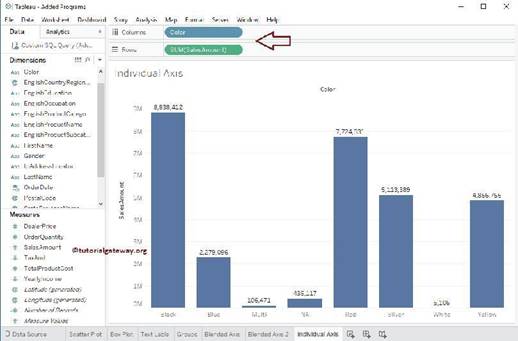
Next, we drag and Drop one more measure value, i.e., Total Product Cost from Measures Region to Rows Shelf. Because it is a Measure value, Total Product Cost is aggregated to default Sum. From the below screenshot, you can observe that Tableau has created an individual axis for each measure (continuous field).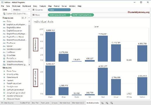
Reference: https://www.tutorialgateway.org/individual-axis-in-tableau/