Which of the following best describes the law of large numbers?
Correct Answer:
B
The best answer is B. As a sample size grows, its mean gets closer to the average of the whole population.
The law of large numbers, in probability and statistics, states that as a sample size grows, its mean gets closer to the average of the whole population. This is due to the sample being more representative of the population as it increases in size. The law of large numbers guarantees stable long-term results for the averages of some random events1
* A. As a sample size decreases, its standard deviation gets closer to the average of the whole population is not correct, because it confuses the concepts of standard deviation and mean. Standard deviation is a measure of how much the values in a data set vary from the mean, not how close the mean is to the population average. Also, as a sample size decreases, its standard deviation tends to increase, not decrease, because the sample becomes less representative of the population.
* C. As a sample size decreases, its mean gets closer to the average of the whole population is not correct, because it contradicts the law of large numbers. As a sample size decreases, its mean tends to deviate from the average of the whole population, because the sample becomes less representative of the population.
* D. When a sample size doubles, the sample is indicative of the whole population is not correct, because it does not specify how close the sample mean is to the population average. Doubling the sample size does not necessarily make the sample indicative of the whole population, unless the sample size is large enough to begin with. The law of large numbers does not state a specific number or proportion of samples that are indicative of the whole population, but rather describes how the sample mean approaches the population average as the sample size increases indefinitely.
A Chief Executive Officer (CEO) is requesting more up-to-date sales data for improved visibility prior to month-end. An analyst must determine the frequency of a sales report that was previously distributed on an as-needed basis. Which of the following would be the most appropriate frequency for this report?
Correct Answer:
C
The most appropriate frequency for the sales report is weekly, as this will provide the CEO with more up-to-date sales data for improved visibility prior to month-end. A weekly sales report can show the sales performance, trends, and issues of the sales team on a regular basis, and help the CEO to monitor and evaluate the progress and results of the sales activities. A weekly sales report can also help the CEO to identify and address any problems or opportunities that may arise during the month, and to make timely and informed decisions.
A development company is constructing a new unit in its apartment complex. The complex has the following floor plans: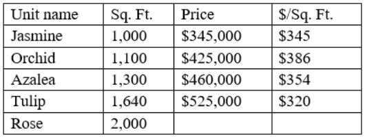
Using the average cost per square foot of the original floor plans, which of the following should be the price of the Rose unit?
Correct Answer:
C
This is because the price of the Rose unit can be estimated using the average cost per square foot of the original floor plans, which are Jasmine, Orchid, Azalea, and Tulip. To find the average cost per square foot of the original floor plans, we can use
the following formula:
Plugging in the values from the original floor plans, we get: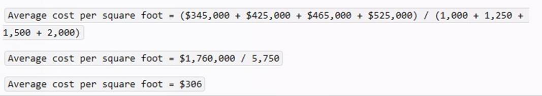
To find the price of the Rose unit, we can use the following formula:
Plugging in the values from the Rose unit, we get: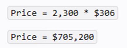
Therefore, the price of the Rose unit should be $705,200, using the average cost per square foot of the original floor plans.
Which of the following technologies would be best suited for creating a multiple linear regression model?
Correct Answer:
B
R is a statistical programming language that is specifically designed for data analysis and statistical modeling, making it highly suitable for creating a multiple linear regression model. It has extensive libraries such as lm() for linear modeling, which simplifies the process of model creation, diagnostics, and interpretation. R also provides robust tools for data manipulation and visualization, which are essential for preparing data for regression analysis and understanding the results123.
While Microsoft Power BI, SQL, and Tableau have capabilities for regression analysis, they are more limited compared to R. Power BI and Tableau are primarily business intelligence tools that offer some built-in analytics capabilities, but they are not as comprehensive as
R. SQL is a database query language that can perform some statistical calculations, but it is not inherently designed for statistical modeling4567.
References:
✑ Multiple Linear Regression in R: Tutorial With Examples - DataCamp1.
✑ Implementing linear regression in Power BI - SQLBI5.
✑ Choosing a Predictive Model - Tableau6.
✑ How Predictive Modeling Functions Work in Tableau7.
A data analyst is designing a dashboard that will provide a story of sales and determine which site is providing the highest sales volume per customer. The analyst must choose an appropriate chart to include in the dashboard. The following data is available: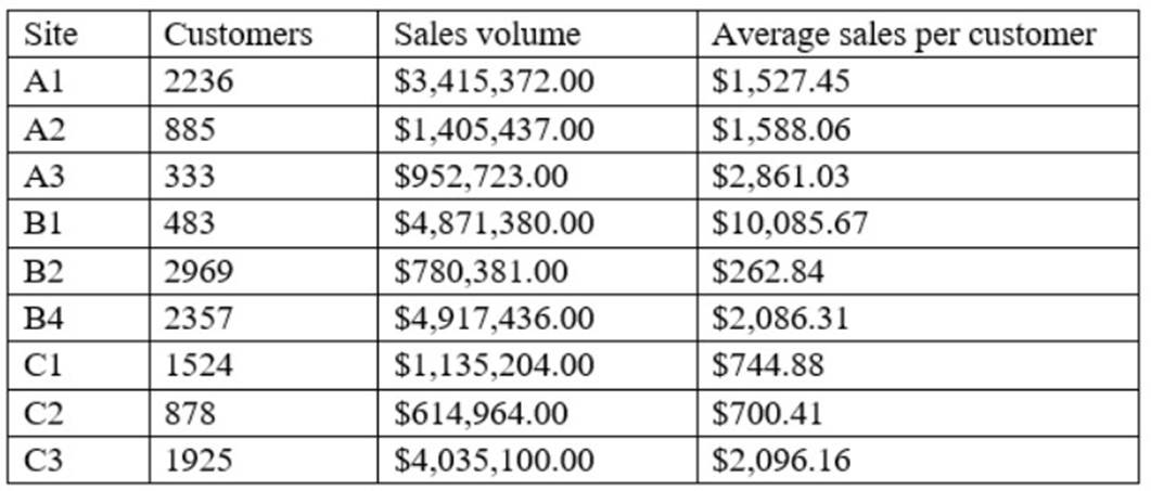
Which of the following types of charts should be considered?
Correct Answer:
C
A scatter chart using sales volume and average sales per customer is the best type of chart to include in the dashboard. A scatter chart is a type of chart that displays the relationship between two numerical variables using dots or markers. A scatter chart can show how one variable affects another, how strong the correlation is between them, and how the data points are distributed. In this case, a scatter chart can show the story of sales and determine which site is providing the highest sales volume per customer by plotting the sales volume on the x-axis and the average sales per customer on the y-axis. Each dot on the chart will represent a site, and the analyst can easily compare the sites based on their position on the chart. A site with a high sales volume and a high average sales per customer will be in the upper right quadrant, indicating a high performance. A site with a low sales volume and a low average sales per customer will be in the lower left quadrant, indicating a low performance. A site with a high sales volume and a low average sales per customer will be in the lower right quadrant, indicating a high volume but low value. A site with a low sales volume and a high average sales per customer will be in the upper left quadrant, indicating a low volume but high value. A scatter chart can also show if there is a positive or negative correlation between the two variables, or if there is no correlation at all. A positive correlation means that as one variable increases, so does the other. A negative correlation means that as one variable increases, the other decreases. No correlation means that there is no relationship between the two variables.
The other types of charts are not as suitable for this purpose. A line chart is a type of chart that displays the change of one or more variables over time using lines. A line chart can show trends, patterns, and fluctuations in the data. However, in this case, there is no time variable involved, so a line chart would not be appropriate. A pie chart is a type of chart that displays the proportion of each category in a whole using slices of a circle. A pie chart can show how each category contributes to the total and compare the relative sizes of each category. However, in this case, there are two numerical variables involved, so a pie chart would not be able to show their relationship. A column chart is a type of chart that displays the comparison of one or more variables across categories using vertical bars. A column chart can show how each category differs from each other and rank them by size. However, in this case, a column chart would not be able to show the relationship between sales volume and average sales per customer, as it would only show one variable for each site.