A report is scheduled to run and be distributed at the end of business each day. On Mondays, one of the recipients opens the previous week's reports and combines them to calculate the weekly totals and projections for the coming week. This is a tedious process, and the recipient asks an analyst for help. Which of the following should the analyst recommend?
Correct Answer:
B
Creating a new report that automatically calculates weekly totals would streamline the process for the recipient. By setting this report to run at the end of business on Friday, it would provide the recipient with the necessary information for the entire week in one consolidated document. This eliminates the need for manual calculations and combines the previous week??s data into one report, making it more efficient and less time- consuming.
References:
✑ Best practices in business analytics suggest automating repetitive tasks and consolidating reports where possible to improve efficiency and reduce the potential for human error.
Given the customer table below: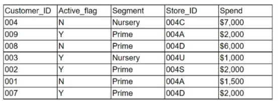
Which of the following chart types is the most appropriate to represent the average spending of active customers vs. inactive customers?
Correct Answer:
A
A Pie chart is the most suitable for representing the average spending of active customers versus inactive customers. Pie charts are effective for comparing parts of a whole, which makes them ideal for visually displaying the proportion of spend between two distinct
groups. They are widely used to depict percentage distributions and are straightforward, allowing immediate analysis of the active vs. inactive customer spending distribution at a glance.
An analyst is building a new dashboard for a user. After an initial conversation with the user. the analyst created a mock-up of the dashboard. Which of the following best explains why the analyst created the mock-up?
Correct Answer:
C
Answer C. To confirm important details before dashboard development begins.
A dashboard mockup is a prototype of a finished dashboard directly in the product. It is a way to visualize the layout, design, and functionality of the dashboard before it is built with real data and code. A dashboard mockup can help the analyst to confirm important details
with the user, such as the business objectives, the key performance indicators, the data sources, the filters, the charts, and the interactivity. By creating a dashboard mockup, the analyst can get immediate feedback and validation from the user, and avoid wasting time and resources on developing a dashboard that does not meet the user??s expectations or needs1.
Joseph is interpreting a left skewed distribution of test scores. Joe scored at the mean, Alfonso scored at the median, and gaby scored and the end of the tail.
Who had the highest score?
Correct Answer:
C
Alfonso had the highest score. A left skewed distribution is a distribution where the tail is longer on the left side than on the right side, meaning that most of the values are clustered on the right side and there are some outliers on the left side. In a left skewed distribution, the mean is less than the median, which is less than the mode. Therefore, Joseph, who scored at the mean, had the lowest score, Gaby, who scored at the end of the tail, had the second lowest score, and Alfonso, who scored at the median, had the highest score. Reference: Skewness - Statistics How To
Jhon is working on an ELT process that sources data from six different source systems.
Looking at the source data, he finds that data about the sample people exists in two of six systems.
What does he have to make sure he checks for in his ELT process? Choose the best answer.
Correct Answer:
C
Duplicate Data.
While invalid, redundant, or missing data are all valid concerns, data about people exists in two of the six systems. As such, Jhon needs to account for duplicate data issues.