An analyst is working on a project for a director. During this process. the analyst pulled the data. created summarized tables and graphs with descriptions, created a report summary, and inserted all items into a report. After writing the report, which of the following would be the most appropriate next step?
Correct Answer:
B
After writing the report, the most appropriate next step for the analyst is to complete a check for quality in the report. This involves reviewing the report for accuracy, clarity, completeness, consistency, and relevance. The analyst should ensure that the report addresses the director??s business questions and objectives, that the data and analysis are correct and reliable, that the tables and graphs are well-designed and easy to understand, that the descriptions and summary are concise and informative, and that there are no errors or inconsistencies in the report. A quality check will help the analyst to improve the presentation and communication of the report, as well as to avoid any misunderstandings or misinterpretations by the director1.
A county in Illinois is conducting a survey to determine the mean annual income per household. The county is 427sq mi (2.65q km). Which of the following sampling methods would MOST likely result in a representative sample?
Correct Answer:
D
Surveys sent to 100 randomly selected homes that are reflective of the population. This is because a random sample is a type of sample that is selected by using a random method, such as a lottery or a computer-generated number, which ensures that every element in the population has an equal chance of being selected. A random sample can result in a representative sample, which means that the sample reflects the characteristics and diversity of the population. By sending surveys to 100 randomly selected homes that are reflective of the population, the analyst can ensure that the sample is representative of the county??s households and their income levels. The other sampling methods are not likely to result in a representative sample. Here is why:
A stratified phone survey of 100 people that is conducted between 2:00 p.m. and 3:00 p.m. would result in a biased sample, which means that the sample favors or excludes certain groups or elements in the population. By conducting the survey only between 2:00 p.m. and 3:00 p.m., the analyst would miss out on people who are not available or reachable at that time, such as those who are working or sleeping. This could affect the representativeness and generalizability of the sample.
A systematic survey that is sent to 100 single-family homes in the county would result in an unrepresentative sample, which means that the sample does not reflect the characteristics and diversity of the population. By sending surveys only to single-family homes, the analyst would ignore other types of households, such as apartments, condos, or mobile homes. This could affect the accuracy and reliability of the sample.
Surveys sent to ten randomly selected homes within 5mi (8km) of the county??s office would result in a small sample, which means that the sample size is too low to capture the variability and diversity of the population. By sending surveys only to ten homes within a limited area, the analyst would miss out on many households that are located in different parts of the county. This could affect the precision and confidence of the sample.
An analyst is designing a dashboard to determine which site has the highest percentage of new customers. The analyst must choose an appropriate chart to include in the dashboard. The following data is available: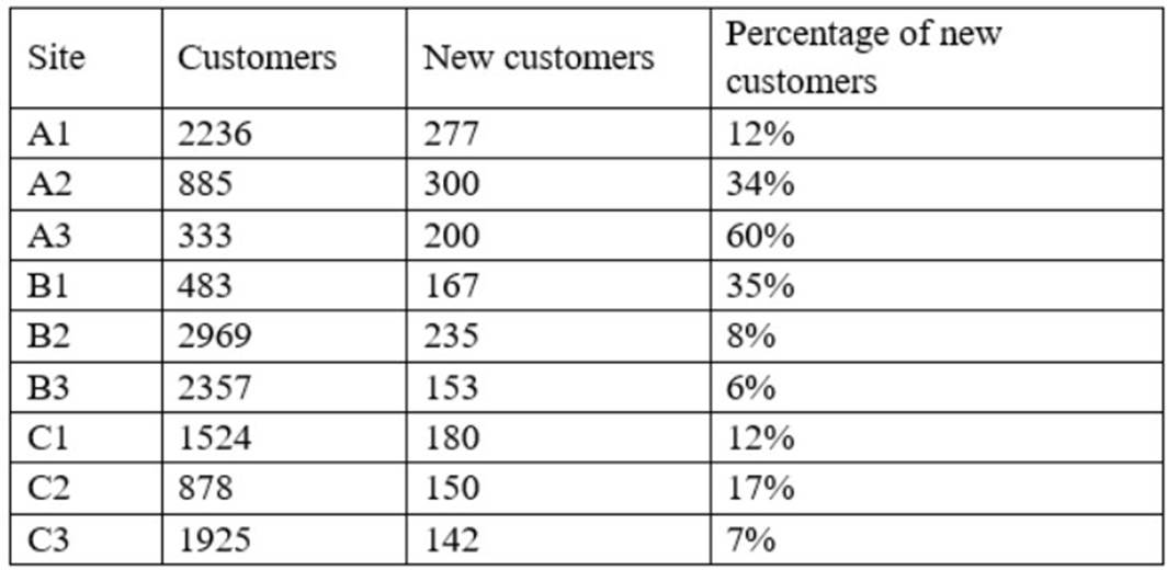
Which of the following types of charts should be considered to BEST display the data?
Correct Answer:
A
This is because a bar chart is a type of chart that shows the value or the amount of a single variable for different categories or groups, such as the percentage of new customers for different sites in this case. A bar chart can be used to display and analyze the comparison, ranking, or proportion among the categories or groups, as well as identify any differences, similarities, or outliers in the data. For example, a bar chart can show which site has the highest or lowest percentage of new customers, as well as show how much each site contributes to the total percentage of new customers. The other types of charts are not the best charts to display the data. Here is why:
✑ A line chart is a type of chart that shows the change or the trend of a single variable over time, such as the percentage of new customers over months or years in this case. A line chart can be used to display and analyze the movement, cycle, or pattern of the variable, as well as identify any peaks, valleys, or fluctuations in the data. For example, a line chart can show how the percentage of new customers increases or decreases over time, as well as show if there are any seasonal or periodic variations in the data.
✑ A pie chart is a type of chart that shows the proportion or the percentage of a single variable for different categories or groups, such as the percentage of new customers for different sites in this case. A pie chart can be used to display and analyze the composition, distribution, or share of the variable, as well as identify any segments, slices, or fractions in the data. For example, a pie chart can show how much each site represents of the total percentage of new customers, as well as show if there are any dominant or minor sites in the data.
✑ A scatter chart is a type of chart that shows the relationship between two variables for each observation or unit in a data set, such as the percentage of new customers and another variable for each site in this case. A scatter chart can be used to display and analyze the correlation, trend, or pattern among the variables, as well as identify any outliers or clusters in the data. For example, a scatter chart can show if there is a positive, negative, or no correlation between the percentage of new customers and another variable, such as sales revenue or customer satisfaction.
Daniel is using the structured Query language to work with data stored in relational database.
He would like to add several new rows to a database table. What command should he use?
Correct Answer:
C
INSERT
The INSERT command is used to add new records to a database table.
The SELECT command is used to retrieve information from a database. It's the most commonly used command in SQL because it is used to pose queries to the database and retrieve the data that you're interested in working with.
The UPDATE command is used to modify rows in the database.
The CREATE command is used to create a new table within your database or a new database on your server.
A user receives a large custom report to track company sales across various date ranges. The user then completes a series of manual calculations for each date range. Which of the following should an analyst suggest so the user has a dynamic, seamless experience?
Correct Answer:
D
Create a dashboard with a date range picker and calculations built in. This is because a dashboard is a type of visualization that displays multiple charts or graphs on a single page, usually to provide an overview or summary of some data or information. A dashboard can be used to track company sales across various date ranges by showing different metrics and indicators related to sales, such as revenue, volume, or growth. By creating a dashboard with a date range picker and calculations built in, the analyst can suggest a way for the user to have a dynamic, seamless experience, which means that the user can interact with and customize the dashboard according to their needs or preferences, as well as avoid any manual work or errors. For example, a date range picker is a type of feature or function that allows users to select or adjust the time period for which they want to see the data on the dashboard, such as daily, weekly, monthly, or quarterly. A date range picker can make the dashboard dynamic, as it can automatically update or refresh the dashboard with new data based on the selected time period. Calculations are mathematical operations or expressions that can be performed on the data on the dashboard, such as addition, subtraction, multiplication, division, average, sum, etc. Calculations can make the dashboard seamless, as they can eliminate the need for manual calculations for each date range, as well as ensure accuracy and consistency of the results. The other ways are not the best ways to provide a dynamic, seamless experience for the user. Here is why:
✑ Creating multiple reports, one for each needed date range would not provide a dynamic, seamless experience for the user, but rather create a static, cumbersome experience, which means that the user cannot interact with or customize the reports according to their needs or preferences, as well as have to deal with multiple files or pages. For example, creating multiple reports would make it difficult for the user to compare or contrast the sales across different date ranges, as well as increase the workload and complexity of managing and maintaining the reports.
✑ Building calculations into the report so they are done automatically would not
provide a dynamic, seamless experience for the user, but rather provide a partial, limited experience, which means that the user can only benefit from one aspect or feature of the report, but not from others. For example, building calculations into the report would help with avoiding manual work or errors, but it would not help with interacting with or customizing the report according to different date ranges.
✑ Adding macros to the report to speed up the filtering and calculations process
would not provide a dynamic, seamless experience for the user, but rather provide an advanced, complex experience, which means that the user would need to have some technical skills or knowledge to use or apply the macros, as well as face some potential risks or challenges. For example, adding macros to the report would require the user to know how to write or run the macros, which are a type of code or script that automates certain tasks or actions on the report, such as filtering or calculating the data. Adding macros to the report could also expose the user to some security or compatibility issues, such as viruses, malware, or errors.