- (Topic 1)
An analytics team employed at a leading credit card company is utilizing data analytics to identify unusual credit card purchases.
They have created the following visual. How many extreme outliers exists in this dataset?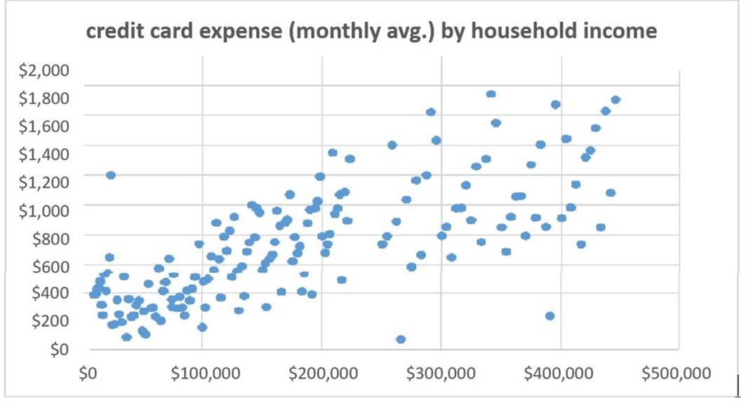
Correct Answer:
C
According to the Business Data Analytics (IIBA®- CBDA) principles, extreme outliers in a dataset can be identified visually on a scatter plot as points that are distinctly separate from the bulk of the data. In this visual, there are three points that are significantly higher on the y-axis (credit card expense) relative to their position on the x-axis (household income), indicating unusual credit card purchases. References: The identification and interpretation of outliers is a standard practice in data analytics and is covered under the Business Data Analytics (IIBA®- CBDA) learning resources.
- (Topic 2)
A grocery store chain has requested help in determining how customer preferences are changing with regards to home delivery. An analytics team has completed researching the number of online orders received requesting home delivery versus in-store pickup. The business analyst has selected a model to enable a quick comparison between curbside pick-up, in-store pickup, and home delivery for the last 3 years.Which model has the business analyst chosen?
Correct Answer:
D
A bar chart is a graphical representation of data that uses rectangular bars of different heights or lengths to show the values of one or more variables1. A bar chart is suitable for comparing the number of online orders received requesting different types of delivery options for the last 3 years, as it can show the frequency or proportion of each category across time. A bar chart can also help identify trends, patterns, or outliers in the data2.
A pie chart is a circular chart that shows the relative sizes of data points in a whole by using different-sized and colored slices3. A pie chart is not suitable for comparing the number of online orders received requesting different types of delivery options for the last 3 years, as it can only show the distribution of one variable at a time, and it does not show the changes over time. A pie chart can also be misleading or confusing if there are too many categories or if the slices are too similar in size4.
A funnel chart is a type of chart that shows the stages of a process and the amount of data that passes through each stage5. A funnel chart is not suitable for comparing the number of online orders received requesting different types of delivery options for the last 3 years, as it does not show the categories of delivery options, but rather the progression of customers through a sales or marketing funnel. A funnel chart can help visualize the conversion rates, drop-off rates, or bottlenecks in a process6.
A scatter plot is a type of chart that shows the relationship between two numerical variables by using dots to represent the values of each pair of data points. A scatter plot is not suitable for comparing the number of online orders received requesting different types of delivery options for the last 3 years, as it does not show the categories of delivery options, but rather the correlation or association between two continuous variables. A scatter plot can help identify the direction, strength, and shape of the relationship, as well as any outliers or clusters in the data.
References:1: Guide to Business Data Analytics, IIBA, 2020, p. 672: Data Visualization: The Definitive Guide, Tableau, 3: Guide to Business Data Analytics, IIBA, 2020, p. 674: Data Visualization: The Definitive Guide, Tableau, 5: Guide to Business Data Analytics, IIBA, 2020, p. 686: Data Visualization: The Definitive Guide, Tableau, . : Guide to Business Data Analytics, IIBA, 2020, p. 68. : Data Visualization: The Definitive Guide, Tableau, .
- (Topic 1)
An insurance company has seen an upward trend in winter-related accidents over the past three years. The company has just completed an analytics study to better understand the primary reasons for these accidents and assess how many of the drivers were using winter tires. This analysis will help the company decide how to move forward with drivers not taking precautionary measures during winter. What type of analysis will help in determining the primary reasons and percentage of those drivers with winter tires?
Correct Answer:
D
Descriptive analytics is a type of analytics that summarizes and visualizes the data to provide an overview of what has happened or is happening, such as the trend of winter- related accidents over the past three years, or the percentage of drivers using winter tires12. Diagnostic analytics is a type of analytics that explores and analyzes the data to understand why something has happened or is happening, such as the primary reasons for these accidents, or the factors that influence the drivers?? decisions13. To answer the question, both descriptive and diagnostic analytics would be needed to provide the relevant information and insights for the company. References: 1: Guide to Business Data Analytics, IIBA, 2020, p. 182: Business Analytics: Data Analysis & Decision Making, S. Christian Albright and Wayne L. Winston, 2015, p. 53: Data Science for Business, Foster Provost and Tom Fawcett, 2013, p. 13.
- (Topic 2)
Allegra Consulting is planning on establishing an analytics system to track career progression of their consultants. Elicitation will be used to identify the required features. How would brainstorming be used to prepare for elicitation?
Correct Answer:
A
According to the Guide to Business Data Analytics, one of the tasks under the domain of ??Identify the Research Questions?? is to identify sources of business information to consider. This task involves reviewing existing business information, such as documents, reports, databases, and systems, to determine what data is available, relevant, and reliable for answering the research questions. This task also involves identifying any gaps or limitations in the existing information and proposing ways to address them. References: Guide to Business Data Analytics, page 18-19; CBDA Exam Blueprint, page 6. Learn more1iiba.org2iiba.org3processexam.com
- (Topic 1)
The interplay between enterprise systems and data analytics can be envisioned at various layers. The layer that connects the business processes to data analytics is the:
Correct Answer:
A
The information layer is the layer that connects the business processes to data analytics. It consists of the data models, data quality, data governance, and data security that enable the data to be accessed, analyzed, and transformed into insights. The information layer also supports the communication and collaboration among the stakeholders involved in the data analytics process. The other layers are the physical layer, which deals with the hardware and software components of the data infrastructure; the technical layer, which handles the data integration, data storage, data processing, and data analysis techniques; and the infrastructure layer, which provides the network, cloud, and security services for the data environment12 References: 1: Data and Analytics (D&A) - Gartner 2: Enterprise Data Analytics - SelectHub